Maths Finally Made Useful To Common Man
 Alternative Title - USA Today Daily Infographic Contains Useful Information For First Time Ever.
![]()
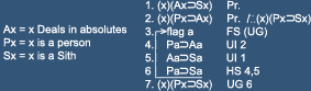
"Only a Sith deals in absolutes" - Obi-Wan Kenobi
Disagree?
Alternative Title - USA Today Daily Infographic Contains Useful Information For First Time Ever.
Posted by
Roscoe
at
12:15 PM
![]()

5 comments:
Pie Charts are my favorite.
nom nom nom
Caleb, are you asking for a Rick'rollin?
This is one of mankind's greatest charts.
I think I like Pie Charts because they are finite. They don't show quantity but rather so relation and ratio.
I like that.
One of the WoW addons I use keeps track of different stats like damage done, healing done, number of deaths, etc. It has a bar graph view and a pie chart view. I find that I enjoy the pie chart view more.
Post a Comment